When Apple introduced iOS 14 last year, it unleashed a whole new rush of amazing widgets, both from third-party developers and Apple itself. Apple’s own apps and now its own widgets are supposed to serve as examples for other developers to be inspired by. But many of Apple’s stock apps don’t actually have widgets yet. Meanwhile, widgets are still static and can’t be made interactive. We’re hoping both of those things change in just under two weeks when Apple unveils iOS 15 at WWDC.
First and foremost, widgets really need to be made interactive in order for developers to really build groundbreaking new tools for iPhone and iPad. Not just like the current Shortcuts widget that can run actions right from your Home Screen, but fully interactive with scrolling, switches, and more. Adding new ways to interact with widgets could let Apple itself build even better built-in ones.
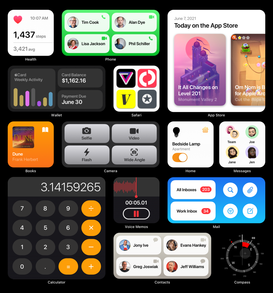
So what apps have Apple not made widgets for yet? Well, let’s start with the big ones. There aren’t any widgets for Phone, Messages, Mail, Home, Health, Wallet, Safari, or even Books. Utility apps like Calculator, Contacts, Compass, and Voice Memos are all obvious candidates for widgets too. There are opportunities for apps like Safari and Mail as well.
Communication
Apple’s core communication apps would benefit greatly from widgets. Phone could show off your top four favorites and let you instantly call or FaceTime them. Mail could show you the number of new messages in individual inboxes and offer shortcuts to search, filters, even a button to start a new email instantly.
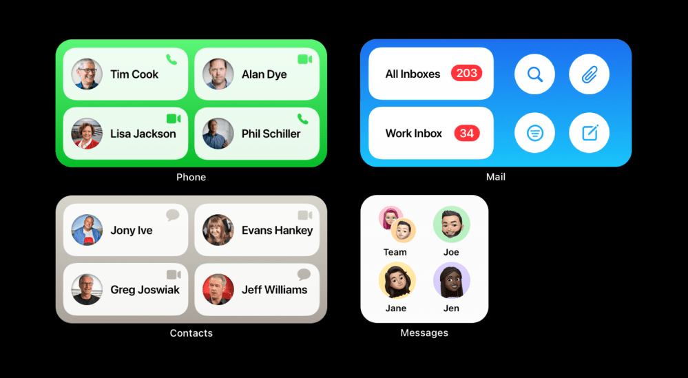
If users want to create custom widgets for all sorts of different actions to take on contacts, they could use a Contacts widget. It could work and look just like the Phone one but also offer shortcuts to sending messages, emails, and more. Messages could display your pinned conversations right on your Home Screen as well with users’ Memoji characters.
Updates and information
The Health app is one in particular that we’ve heard lots of people ask for. Fitness can show your Apple Watch rings and charts on your Home Screen, but you can’t customize what other metrics are visible. Apple could introduce a Health widget that allows you to stick your most important metrics right on your Home Screen. You can’t even place a simple step counter that opens the Health app right now on your Home Screen.
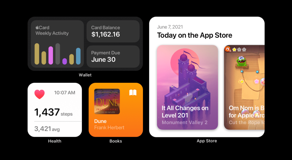
The Books app is the only Apple audio app that doesn’t have a now playing widget. It could gain some that match the Podcasts and Music widgets. The Wallet app is an increasingly important financial tool for people, and with Apple Card, you can see even more types of metrics. A new Wallet widget could show your card balance, due dates, and your weekly activity. Meanwhile, the App Store could gain an interactive widget that lets you see the Today view cards right on your Home Screen in an effort to tempt users to download more apps.
Utilities
Apple’s built-in utilities tend to get left behind when it comes to major new features, at least at first. Apple’s utility apps are perfect candidates for widgets. A large widget could display a full-size simple calculator that’s fully interactive. If Apple was willing to, there could even be a full-fledged Compass widget that’s entirely live when it’s visible on the Home Screen.
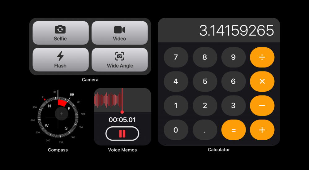
Voice Memos would be a great addition to iOS. Users can currently add Reminders and Notes widgets to their Home Screens, but those who primarily use voice memos for saving information were left in the dust. A new Voice Memos widget could let you record audio right from your Home Screen. Camera could even gain a platter of deep links that automatically change the camera mode upon launch.
Switches and links
Other apps have tried to fill in the Home widget gap, but no one will be able to build something quite as good as Apple can. Apple could let you plop switches from your Home right on your Home Screen or create larger widgets that show multiple switches.
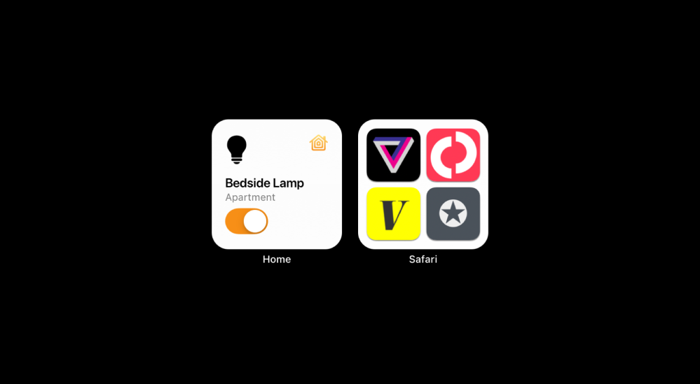
Safari could also gain widgets that let you quickly jump into your favorite websites on the fly. Users could group sites by different categories if they wanted to in a more neat and tidy way than they can with app clips and folders.
Conclusion
At the end of the day, interactive or not, Apple should bring widgets to more of its stock apps. They can help set a new bar for developers to make even better widgets. You can check out all of these stock widget concepts below. Let us know in the comments what you think of these ideas too!
FTC: We use income earning auto affiliate links. More.
Check out 9to5Mac on YouTube for more Apple news:
The Link LonkMay 27, 2021 at 12:56AM
https://ift.tt/2RRjTOC
Concept: How iOS 15 could boost widgets with interactivity and new stock app options - 9to5Mac
https://ift.tt/2ZaIe2Q
iOS
:no_upscale()/cdn.vox-cdn.com/uploads/chorus_asset/file/22686894/backboneonexbox.jpg)
No comments:
Post a Comment